Sunday, 29 May 2016

[int]: workshop - how to design luxury

I've seen a glut of interiors where money appears to have been thrown blindly at the room, with velvet soft furnishings, diamantes, and crystal chandeliers. To me, these efforts just look gaudy. There's a much better way to design in luxury.


Photo credit: bungalowclassic.com

When designing an interior, you need to think about how you're going to live in it. So think about the amazing dinner parties you'll have, yes, but also think about when you've got the flu. When you want to curl up under a blanket and get comfortable, where are you going to do that? Certainly not on sequin embroidered pillows. So instead of that, I've got a few ideas about how you can bring some sophistication into your home.

1. Greyscale

A careful use of neutrals can add some elegance to your home, making it seem more sleek, less cluttered. To bring a little more warmth into the space, choose one highlight colour and use it sparingly. Metallic accents also work well; try warm colours like copper or brass and coordinate throughout your room.

Kitchen, photo from Raya Todorova on Behance 

This kitchen uses a beautiful palette of charcoal grey, off-white and pale wood. The materials used are stunning and well finished, and the whole composition is complimented by the brass stools and pendant lights.

2. Well made furniture

An entire room can hang off a great piece of furniture. Choose something that fits your style, with a timeless quality. It will make for a great investment, and will instantly add an extra level to your space.

Flow chair, Ercol

Designer companies like Ercol have been tested for generations, and still make beautiful, up to date furniture. They carry a hefty price tag, but for real luxury you do have to spend more, and when you buy a piece you love it will stay with you for years.

3. Organised design

Clutter makes an interior look too fussy, but clean lines keep the character simple and strong. Take one idea and run with it; even in a large room you don't want to try to combine too many ideas for a luxurious feel.

Bedroom, photo found at thescoutguide.com

Every element of this bedroom has been carefully placed, with simple furniture. The frames on the walls have been arranged beautifully, and the cushions on the bed are mirrored along the centre line. There aren't too many cushions, too many pictures or accessories. Everything has been balanced, which gives the feeling of luxury.

4. Textures

I'm not endorsing damask sofa fabric or velvet curtains here - what I mean is the textural feel of your furniture. Choose something that's a joy to touch, as well as to look at.

Kitchen, photo from thedesignchaser.com

This kitchen uses a combination of rough wooden flooring and smooth polished stone, which will hold your interest for a long time after the novelty of a new interior has worn off.

5. No fakes

I'm serious here. If you don't have the budget for the real thing, nine times out of ten you'll be disappointed with how the facsimile holds up over time. Instead, I'd look for alternatives that preserve your style, like a richly polished concrete instead of stone countertops. The same holds for products like brick effect wallpaper or artificial plants. When you're up close, they don't throw the right shadows, and they don't move right.

That said, there are some exceptions to the rule. I wouldn't attempt them unless you've seen them in situ, at least a couple of years after they were installed. You want to see how well these replacement products last before you buy them yourself.

Polished concrete countertop, photo from bloglovin.com

I love the use of this polished concrete, giving the same sleek finish as stone would. It's equally hardwearing, and far less expensive than solid stone.

6. Maintenance

You might have a team of cleaners on hand to sweep up every little mess, but regardless, an interior that isn't hardwearing is going to deteriorate quickly. Keep children and pets in mind, and avoid spindly, fragile furniture if you think it may be damaged. Cats can destroy a sofa, so you would do well to cover yours with a throw if you own one. Metal can be less easy to scratch than wood, and I would keep vases out of reach of children.


Round coffee table, photo from bloglovin.com

This round table has no sharp corners for children to run into, and the stone top is hardwearing and difficult to damage. I love the three-legged design and the combination of materials too. It proves that your furniture can be both beautiful and practical.

If you have specific needs and want a luxury design, it might be worth your while to hire an interior designer. Be sure to make sure they're interested in styles that you like, too, or you may end up with something gaudy and ostentatious rather than stylish and sophisticated.

Friday, 20 May 2016

[int]: living room - photo to interior

When designing an interior, I like to start with an idea that sums up the project. That could be anything from a quote to a colour scheme. A photo works really well, but I'm always cautious of using a photograph of an interior I like, in case it locks me down into an idea I won't be able to accurately replicate.


I took this photograph in Kew Gardens. I love the distressed paint next to the clean green of the plants, a look that would be great in a industrial style living room, with big french windows out to a garden. I'd start by fading the boundaries between inside and out, bringing plants indoors.

Hanging planter, photo from theglitterguide.com

I'm absolutely in love with these hanging planters. Choose a plant with luscious green leaves like a peace lily or a fern, and a simple pot.

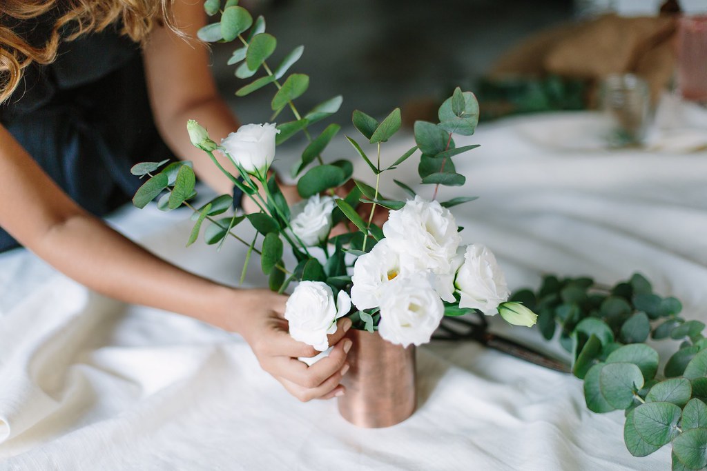
DIY copper vase, Bloglovin.com

This idea for a copper vase is gorgeous, and picks up on the industrial style from the photograph. The shining, sleek metal contrasts perfectly with a distressed look, which you can easily get with some second hand furniture. Use chalk paint in a gentle off-white, and sand back around the edges that would get bashed up over use. Wax over the top to complete the look and seal the furniture. I'd be careful not to go too far with the distressing if you're also buying new furniture. A little contrast is good but a lot is jarring, so you may even want to opt for plain white furniture or wooden pieces, depending on what else you're working with.


Weathered coffee table, photo from blesserhouse.com

White interior, photo from stilinspiration.blogspot.co.uk

The interior shouldn't become too cluttered, so I'd keep the walls painted white, with a few simple frames. Soft furnishings, however, are a chance to bring in some more of those gorgeous green tones. Choose a green sofa or a patterned green chair, or accessorise neutral furniture with cushions and throws. Don't be afraid to play around with shades of green, but check before you buy that they aren't going to clash.


Jangala leaf cushions on green sofa, Made.com

Green leaf cushion on neutral sofa, photo from estmagazine.com.au

All these different ideas need one single focus point. Keep the emphasis on one item, and make sure the other pieces of furniture aren't strong enough to compete with it. You could pick a large floor planter, a copper lamp, or a statement chair.

Chicago floor lamp, Made.com

And don't forget to consider what you're going to feel under your feet. Wood flooring will help that feeling of being outside. Though the texture is different to wooden decking it creates that connection to the natural world.


There are a few routes you could go down with this interior, sleek with deep greens and shiny copper, or a more lived-in feel. If you enjoyed this post, please go ahead and share!

Sunday, 15 May 2016

[int]: short term lets

There's a lot of advice out there for how to make a rental place your own, but very little of that works short term. I'm at a stage where I have to keep moving around, and in doing so I've learnt a few things about how to feel at home in your rented space.

The chances are, if you're living in rented accommodation on a short term contract, it's fully furnished. That seems useful, of course, but means there's little in the interior that you can put your own mark on. And there are a lot of horror stories when an absent landlord has control over your living conditions. I've experienced poorly constructed furniture, missing drawers, and a leaking ceiling at various points. At best, the furniture has been ill matched and the decor poor.

My current room is covered in ugly woodchip wallpaper and one of the walls is painted pale yellow. The bedside table has no drawers and the two built in wardrobes have different types of door. There is white paint splashed over the curtains, which are held up by precariously balanced poles. But I chose the place for its location rather than its interior design, and I will only live in it for another three months. Until then, I'm following a few rules to make the most of the space.

1. Choose your room carefully

Before you start looking, decide on your priorities. Are you looking for a room in a shared house, something more self contained, or a flat? What sort of size do you want? What orientation, what location? These things you can't change, and really affect your experience of the place you live in. There is nothing you can do to increase the amount of natural light in your room and there is only so far you can go to block out sound. Everything else about your room hangs on bricks and mortar.

Everything is a trade-off, this room is light and airy but small (image found on Pinterest)

2. Colour Schemes

This is where I'd usually start with designing an interior. But when you're moving around a lot it's just not practical to stick to one theme. It's unhelpful to choose a room based purely on aesthetics, so you can't plan your soft furnishings, lamps and decoration ahead of time. It gets far too expensive to replace everything every time you move, too! I go for a rule of bright primary colours, because the chances are the room will be relatively neutral, and primary colours will immediately add some life to that, but you could also go for neutral colours with a few cheap items in bronze or a bright colour that can be replaced if they really don't work with your next home.

Neutral patterned bedding, Anthropologie

3. Storage

Even the most horrific of rooms look better without mess. I prefer all my possessions to be tidied away in drawers but sometimes the furniture just doesn't allow that. I've been provided with a set of shelves, so I bought a simple basket from Primark to hide all my little items inside.

Makeup can be a nightmare. If you have enough, you can buy a stacking set of drawers or boxes that can be easily packed up whenever you need to move. I have a few bottles and tubes that I need easy access to, so I bought a few enamel cooking trays from a pound shop to keep them all in place. I've also seen some great displays with charity shop cake stands or cut glass ashtrays.

There's also the constant danger of the floordrobe. Instead, I have a fabric set of hanging shelves that I've put into one of the built in wardrobes, the one with the doors I like least. I've left the doors open so it's easy to put scarves and jumpers straight onto the shelves. I find I need tidiness to be easy, or I'll let my room fall into a mess.

Hanging storage shelves, Ikea

4. Decoration

There are  plenty of things that you can take from place to place, that can mean home more than the room itself. My family had a picture taken of us all before I left for university, and I have that in a frame, as well as a few pieces of artwork that I love.

Bunting

I've made some bunting that I have hanging up around my open wardrobe, and that adds a little fun to the room. Memories are also important to display - science shows you're actually happier surrounded by photographs of your friends! A lot of people go for a photo wall but I have a corkboard of ticket stubs, invitations and wristbands of things I want to remember that has the bonus effect of filling up a large amount of space on the yellow wall.

Cork board, Argos, with ticket stubs
Plants are also important, bringing some life and colour into the room as well as purifying the air. I have two windows in my room and I've put my plants on the sills, trying to complement the main colours of that side of the room with the colour of the plants.

House plant

5. Don't break anything

This rule is pretty simple. If you're not going to be living there for long it's not worth losing your deposit! Hide what you can of the things that you hate under the bed or in cupboards, and try to cover up marks on furniture rather than scrapping the piece altogether. Ask the landlord to put in picture hooks for you, or use removable sticky ones, rather than risk nailing through a cable or pipe.

6. You

The most important thing to do is to look critically at the way you live. What makes you happy in a home, and what can you do to increase the opportunity for that? I know that I can be happy with mismatched colours and furniture for a short while, so long as I have tidiness and natural light, so I promote that in my room at the expense of a harmony of style. Look at the way you live now, at your routine, and what you could do to make it easier.

If this has helped, please let me know by sharing!

Wednesday, 11 May 2016

[int]: grand designs live - trends

A final mop-up post for you all, looking at the odds and ends from the exhibition.

Sofa, Adventures in Furniture

Everyone loves leather sofas, right? Wrong. The pieces that stood out for me the most were much more textural, more interesting to touch. Using light neutrals helps to bounce natural light around your space, and the base colours can be accessorised with throws and cushions that permeate your colour scheme throughout the room. Big, blocky styles like this sofa are really comfortable to sit in and have real presence in the room.

Hanging planters from Where the Wild Things Are room set, Nisha Stevens

These hanging planters were everywhere in the show, and turn up on my pinterest feed all the time. There are loads of different tutorials available with different knotted patterns, so have a look around and see what you like best. Be careful what plant pot you use, though; one with a hole in the base will drip dirty plant water through to your floor!

Herringbone flooring, Jack Evie

I absolutely adored this flooring idea. Herringbone patterns in tiles are everywhere now, so why not floors? The use of stained or painted pieces brings a subtle colour into the room, in a really unique way. And this effect is so easy to recreate at home with reclaimed flooring or even by applying wood stains to shop-bought pieces. Test the mix out first before you lay them, to make sure the effect looks right in the room.

That's it for Grand Designs Live. If you'd like to see more photos from the show, look here or go to the Grand Designs Live twitter feed.

Saturday, 7 May 2016

[int]: grand designs live - lighting

I got seriously excited about some of the lighting at Grand Designs Live, and I'd like to let you in on the hype.

Statement lighting is one of my absolute favourite tricks to a great interior. The quality of the light you put into a room really effects the mood, and that draws a lot of attention to the lighting you use. It's a great opportunity for an accent piece, especially in a room where you have little other opportunity to make the space your own, like a rental or a small home.

Pendant lights, Culinary Concepts

Small pendant lights like these, or clusters or arrangements of them, look great in small spaces. Be careful in larger rooms, though, or they might start to get swamped. A line of these gorgeous jam jar lights along a breakfast bar in a kitchen, or a cluster in a small nook, would look great and wonderfully atmospheric. They're very of their time, though, so be aware that in a few years time you may want to change the look up.

Pipe chandelier, Jam Jar Lights

This light is a little more lasting, provided you're a fan of industrial chic. There's a range of interior styles it can be used in, from sleek and well curated to a little bashed up around the edges. I've also seen this pipe style in floor lamps which, at eye level, can be more prominent in the room with careful placement.

Floor lamp, Culinary Creations

This was my absolute favourite floor lamp at the show. It was made from a Rolls Royce headlamp, or so I heard, and it's beautifully unique. It would provide a stunning focus in a minimalist living room, but it definitely needs to be given some space to breathe.

Table lamp, Raft
For a smaller budget, or a smaller space, table lamps like this can be used to bring a similar character to the space. I love the proportions of this little light, bringing the attention to the fitting itself.

Pendant lights, Jam Jar Lights

Whatever your project, there are a few things to consider with statement lighting. Make sure you fit the size of the light to the scale of the room or area you're looking to design. Don't let the light get lost, or overbear the space. Match the styles of the light and the room, otherwise the whole space will feel discordant. And most of all, consider the type of light you need to use the space. It's no good putting a small pendant light in your living room if you want to sit on the sofa and read in the evening, it's just not going to direct the light where you need it.

If this post has piqued your interest, or helped your project, please don't hesitate to like and share!


Wednesday, 4 May 2016

[int]: grand designs live - wood furniture

With this series of posts I'll be putting the focus on specific groups of furniture to talk through what I saw at Grand Designs Live. This time, it's the turn of wooden furniture of all shapes and varieties.

I love using wood in the home. A lot of people shy away from it because they think it doesn't look 'modern' enough and use chrome or painted furniture instead. But well designed wood furniture is stunning and adds warmth both to your colour scheme and to your interior - unlike glass or metal which saps the heat from your skin when you touch it, wood feels the same temperature as the rest of the room. Touch is a very important sense to consider when buying furniture, as you're going to be interacting with the piece with more than just your eyes.

Dovetail Joint, Fineline Furniture

It's tempting to be taken in by the overall look of a piece, but make sure to check the detail. The more you use a piece of furniture, the more you will notice every single aspect of it, good or bad. I love this dovetail joint by Fineline Furniture, using dark wood for the vertical pieces and light wood for the horizontals to highlight the junction. It's stunning how the designer has drawn attention to the joint rather than trying to hide it.

Chair, Joined + Jointed

There were some gorgeous pieces on show, like this chair from Joined + Jointed. Its 70s style curves give movement and balance to the chair, and it would be ideal as a statement piece.

Bureau, JackJames Furniture

I absolutely loved this fold-out bureau from JackJames Furniture; the bright corners of paint give a modern, fun feeling to the piece when closed, and it's filled with functionality when open. It would work so well in a project where you're tight for space.

Table, Fineline Furniture

But style alone isn't the only reason to choose furniture. Take this table from Fineline Furniture. I love the ingenious way that tables like this open up to add a couple of extra spaces. There are a few types of systems that you can get like this, folding or opening, but this is one of my favourites with its sleek mechanism. You can tuck it away when you want some extra space, or open it out for guests.

Dining chair, Fineline Furniture

Comfort is also something to consider. Again from Fineline Furniture, this seat back follows the gentle curve of the spine to support the back, and gives the chair its elegance.

Lamp, Joined + Jointed

I'd like to leave you on this lamp by Joined + Jointed, an all-wood lamp. It's finished to a high polish so the light plays of the curved surface of the shade beautifully. And it's just that little bit different, which really adds a touch of individuality to your room.


If you liked this post, please share! It lets me know what's working.

Sunday, 1 May 2016

[int]: grand designs live - show interiors


I'm pleased to say that the photos are now up on pinterest! I'm planning a whole series of posts on the things I've seen at Grand Designs Live, and how you can take those ideas into your own home and designs. But for now, I'd like to take you through my favourite of the Room Sets (located around the Grand Interiors Theatre).

This year the rooms have been themed around fictional places, and I was amazed by how they captured the feel of the place while still, a lot of them at least, feeling relevant. I've picked out my three favourites to talk you through.

Neverland, Zoe Hewett Interiors
Neverland was gorgeous, a very masculine space that felt like a 'den', themed around travel but dark and textured and homely. To get this look: you want a colour palette that focuses on warm greys, deep blues, and a light contrasting colour. Warm, dark wood is key, and a few statement pieces that draw the eye. This coffee table from Made.com really makes an impact and the triangular metal frames of the legs add to the transitory, camp feel.

Fass table, Made.com

Scatter prints across the wall, though choose them carefully to reflect the colour scheme, like the pinks in the print on the right echo the flamingo at the back. Most importantly, don't overdo it! This tiny space has been filled as an exhibition, rather than something you would want to live in, so it's important to take the ideas of the look and not try to replicate it too faithfully.

Pandora, STEFA Interior Design

The Pandora (you know, from Avatar) inspired space was much more contemporary, with a lot of block blues and greens. The wallpaper was beautiful, a Morris-esque palm frond pattern that the rest of the interior hung off. However, I think it was a little overdone. In your own home, I would bring in a contrasting colour, or perhaps some more chrome or wood, to break the single-colour monotony and bring a little more sophistication into the space. John Lewis has some great wallpaper, like this one, which can be used as a feature wall.

Manila wallpaper, Sanderson @ John Lewis

Take a sample with you though when you go to buy furniture, the worst thing that can happen is for a colour to not quite work. It ruins the whole room and isn't easily fixed, especially if you've just bought an expensive new sofa in slightly the wrong shade.

Secret Garden, Create Perfect

My absolute favourite was the Secret Garden themed interior. Plants wound around shelves and crates and I loved the copper-coloured leather chairs. This was all set against a brick-effect wallpaper which, while I hate false prints like that, would work very well against a brick wall in a real home. This look is something to bear in mind for an extension to an older house. Building up against an existing wall brings the weathered brickwork inside. Or if you want something like this in your existing kitchen or dining room, consider aged floorboards instead of the brickwork to bring that bashed up around the edges feeling in. Pair a solid oak table that will last you for years with some statement chairs. These from Made.com give you the leather look on a budget.

Braga dining chairs, Made.com

There's still a lot more to come from Grand Designs Live, but if you've liked this post please let me know by sharing or liking it!