The classical style of this walkway combined with the warmth of the chandelier and the wall hanging is really effective transposed into a more domestic setting. I chose a dining room as it's the perfect opportunity to combine hard surfaces and rich fabrics as in the image above.
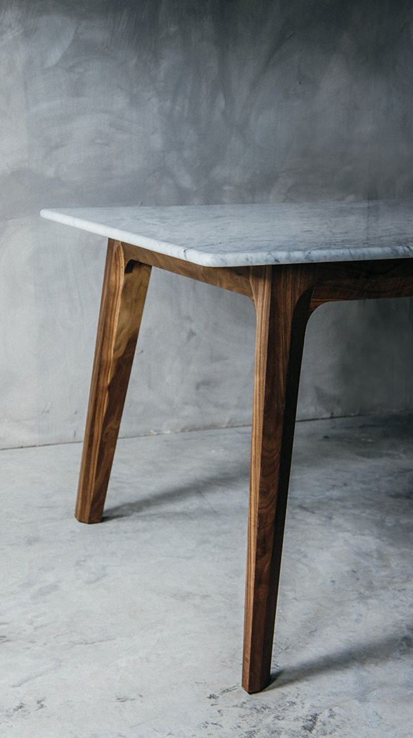
To start off with, I'd choose a statement dining table. The large plane of the tabletop is a great place to set the mood of the room, a large flat plane where you can add interest and experiment with something other than wood.
 |
| Julian table, Namuh (image credit Luis Luna on Behance) |
This dining table has a gorgeous, simple shape, and the top is a beautifully polished stone, filled with shadowy veins that you'll never tire of looking at. The table is simple and well proportioned, a reference to the classical style used in the photograph above. But to get furniture of this quality, you'd have to spend a significant amount of money.
| Dante dining table, Made.com |
For a more budget friendly solution, look for tables with contrasting top surfaces, like this one from Made.com. The difference in tone and texture gives the table a very contemporary feel and, like the more bespoke stone option, provides a cold and crisp starting point to build from.
The best way to counter this sharpness is with soft furnishings. I would build out from the dining table, looking next at the dining chairs. To really bring in warmth, look at small splashes of bright colour.
| Adelaide chair, Raft |
This chair from Raft confines the upholstery to the seat alone, and you can choose from different fabrics for the cushion. You could look for a range of different colours that both complement and contrast your colour scheme, to really draw the eye in. Or pick one key colour and use other aspects of the room to accent it. Consider the texture as well - for a really rich feel as well as long lasting durability look for something thickly textured.
A really nice technique for a dining room is to use a rug to set out the eating space. This can be particularly effective when you contrast the thick pile of the rug with a smooth tile or a simple wood floor, emphasising the warmth of the rug. Make sure to buy a rug that entirely encloses the table and chairs, even when pulled out, or you'll end up sitting with two chair legs on the rug and two on the tile. Match the shape of the rug to the shape of the dining table so that the geometry doesn't clash.
| Pandrup rug, Ikea |
Ikea have a surprisingly wide range of rugs, priced from a very reasonable £19 to around £300 for a handmade rug. They have a lot of different designs, but I would choose a geometric pattern for an up to date look. If your dining tables are more subdued, you can really pick up bright and interesting colours in the rug, like the one shown above. Otherwise, look at rugs with a white pattern over a single colour.
 |
| Tuscan Viga Chevron Rug, Rugs USA |
Careful lighting is the key way to make all of this tie together in a warm and welcoming family environment. Pendant lighting over the table can help signify that area as the focus of the room.
| Glass & Crystal Spiral Pendant Chandelier, BHS |
You can find some gorgeous chandeliers and pendant lights just on the high street. This one from BHS is both opulent and modern. For a space like this, I'd make sure to test out the lights before you buy, if you can. See how far the light reaches, what colour it is, and whether that will work with your design.
The finishing touch to the room is the decoration of the walls. If you have any existing picture rails or mouldings in the room, don't get rid of them. They're a wonderful classical reference. To update the look, paint them and the skirting bright white. Choose a pastel, washed out shade of the main colour from your design for the walls to keep the design light and airy.
 |
| Photo credit: homedesignetc.com |
The different routes that you can go down with this interior depend on your tastes and your budget, you can look towards more opulent styles or a simpler design. Both have the same feeling, a contemporary twist on classical style, contrasting cold, polished surfaces with warm light and soft fabrics.
If you liked this post, give me a shout, and I'll write more like it!


No comments:
Post a Comment