Showing posts with label home. Show all posts

Sunday, 1 January 2017

[int]: bedroom, melbourne australia

So, this has taken a while to write up! Travelling may have slightly got in the way. But I've moved into a new place in Melbourne and I thought I should show you what I've done with it.


Due to some unforseen circumstances this isn't the apartment I planned for. Instead, I'm in a room in a shared house, so I don't have as much leeway to play with furnishings. But I'd like to take you through the things I have been able to do to make the room my own.

Earlier, in this post, I talked you through my plans for the apartment. Well, they haven't changed, just narrowed slightly. I still wanted to use dusky, restful tones to create a relaxing space, and focus on natural wood to create texture. When I got into the room, though, it was pretty run down. It really needs a repaint, and some of the furniture was so bashed up it needed to go. I had to make some pretty quick changes to be happy there.

\New bedsheets (K-Mart) and new art!

The first step was colour. That's pretty easy to bring into a bedroom as you have a lot of soft furnishings to play with. Of course, I was limited for choice because of budget, but I found some pretty geometric patterns with a navy base that brighten up the place nicely.

After that I thought of art. I went to a craft fair in the city and picked up a few unique pieces that I love to give focal points in the room (and draw attention away from the faded paintwork). I made sure to choose personal pieces, rather than something more generic that fits the colour scheme, so that I won't tire of them. With the addition of a plant and a bit of organisation, it almost felt like home.

New fox print and new mirror (The Reject Store)

There were a few more kinks to iron out, but that involved furniture, and that's more than enough for another post - stay tuned! I should have the next one up soon!

Saturday, 30 July 2016

[int]: workshop - how to use mural wallpaper

I've always been wary of mural wallpaper, because it can so easily go wrong. But I've seen some gorgeous examples recently, and they're starting to change my mind.

Photo credit: DreamyWall on Etsy.com

Because it's so easy to get wrong, I thought I would share with you the tips I've learnt from the best mural designs I've seen.

Choose an atmosphere

Photo credit: apartmenttherapy.com

There are some beautiful landscape wallpapers that can transport your room into a different world, or colourful murals for a lively summer atmosphere. Decide what you're trying to achieve before you start looking. The example above is very misty and enigmatic, while the one below is much brighter. By using an ombre pattern rather than a photograph the room is given a fresh, modern feel. You can  also paint ombre designs if you hate the idea of hanging wallpaper.

Photo credit: pixersize.com

Stay simple

Photo credit: muralswallpaper.co.uk

Don't try to do too much with the rest of the room. By using an image on a feature wall you automatically draw all attention to that wall, and if you try to add accent furniture then too many items will jostle for attention. Instead, try a stripped down, neutral scheme with simple pieces of furniture. When choosing soft furnishings, complement the tones of the wallpaper if you're looking for a relaxed atmosphere, or contrast for a brighter feel. The image above uses furniture which echoes the muted colours of the wall or remains neutral in tone, which is why it is so successful. It also places the key items of furniture against the wall, grouping the visual interest into one area of the space and using the focus of the wall to draw you towards the sofa and the lamp.

Avoid your holiday snaps

Photo credit: apartmenttherapy.com

In my friendship and family circle there are some great photographers. But I would never recommend their photographs for use as wallpaper, for one simple reason. They weren't designed for that purpose. An amateur photographer is unlikely to have the equipment needed to take a photograph of high enough resolution to blow up and put on an entire wall. You'd also have to send the photograph out to specialist printers, and in doing that you can't check the way the colours print. You could end up with something washed out, or just completely the wrong tone. To avoid disappointment, go for a wallpaper that you can check over first. The example above is very blurry, which I am not a fan of.

Don't pretend

Photo credit: lushome.com

Is there really a path that leads out of the back wall of your living room? I thought not. While photographs that draw the eye in usually add interest, they are not going to make your room look bigger, and they will mess with the perspective of the room if you're not looking at them from exactly the right angle. Instead, choose an image that was taken straight on.

Restrict the amount you use

Photo credit: apartmenttherapy.com

Don't try to paper the entire room in forest - it won't make you feel like you're in the forest, it will just feel overboard. Try sticking to one wall to draw the attention. In the image above, the photograph is confined to the space between two columns, which demarcates a very natural area to fill.

If you give this a go, why not post a photo in the comments!

Sunday, 24 July 2016

[int]: summer update

With the gorgeous weather outside, it's time to bring some of that summer sunshine into your home. Here's my list of accessories and techniques to do just that.

Photo credit: marine21 on favim.com


1. Cushions


Cushion cover, H&M

Cushion cover, H&M


Cushions are a great way to bring colours and patterns into your living room, bedroom, or even dining room. You can switch out the cushion covers as often as you like to change the look of the room. Check out H&M's collection for some great patterns, which you can get in different colours, and sometimes match with other items like table runners. Go for natural or geometric patterns and bright colours for a vibrant summer look.

2. Tableware


Coastal tableware, John Lewis

There are a lot of different ways you could go with your plates and bowls, but I love these blue tones. They're a gorgeous British take on a Mediterranean feel, perfect for serving up summer salads on a hot day.

3. Glassware


Flimra glass, Ikea


Summer is the time for long evening cocktails, and there's no better way to serve them up than in cut glass. Inside the glasses, a brightly coloured cocktail will glitter like a jewel. Ikea sell inexpensive but stylish glassware, and for something that breaks or scratches in the dishwasher, I don't understand spending any more than you have to.

4. Art

Wild Ruby by Olivia Wade, allposters.co.uk

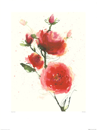
In researching this post, I found a brilliant 75% off sale at allposters.co.uk - so there really couldn't be a better time to grab some summery art. Prints can be very cheap, so you can set up an art wall with different sized frames and just swap out different pieces of art if you get bored or want to change the look of the room. Art is a really personal choice, the picture above chosen because I absolutely love it, but what I would say is that for a summery feel look for vintage travel posters or bright pops of colour.

5. Kitchenware

Zoku Ice Lolly Ring Moulds, Lakeland

I'm not just talking about giving your kitchen a bit of a summery colour theme here. In the hot weather it's really important to drink a lot of fluids and you can find some really fun ways of making sure you get enough. I love how silly these ice lolly moulds are, and they'll definitely cool you down at a weekend barbecue.

I hope you enjoy the rest of the hot weather!

Monday, 18 July 2016

[int]: dining room - photo to interior

You might have noticed that I recently took a couple of weeks off from this blog. I went on holiday, a tourist trail around London and Oxford, and it was while I was at Blenheim Palace that I took this photograph. The whole place reminds me of a time when, for the incredibly rich at least, a person's home was their castle. It's a look a lot of people want to return to, but it can be difficult to make this kind of luxurious style work in a more contemporary setting.


The classical style of this walkway combined with the warmth of the chandelier and the wall hanging is really effective transposed into a more domestic setting. I chose a dining room as it's the perfect opportunity to combine hard surfaces and rich fabrics as in the image above.

To start off with, I'd choose a statement dining table. The large plane of the tabletop is a great place to set the mood of the room, a large flat plane where you can add interest and experiment with something other than wood.
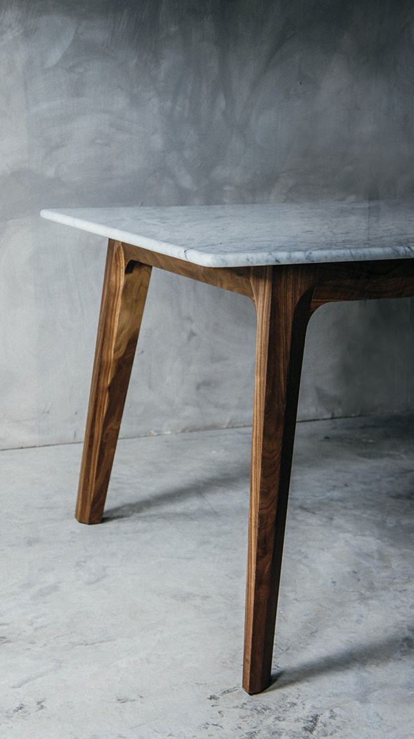
Julian table, Namuh (image credit Luis Luna on Behance)

This dining table has a gorgeous, simple shape, and the top is a beautifully polished stone, filled with shadowy veins that you'll never tire of looking at. The table is simple and well proportioned, a reference to the classical style used in the photograph above. But to get furniture of this quality, you'd have to spend a significant amount of money.

Dante dining table, Made.com

For a more budget friendly solution, look for tables with contrasting top surfaces, like this one from Made.com. The difference in tone and texture gives the table a very contemporary feel and, like the more bespoke stone option, provides a cold and crisp starting point to build from.

The best way to counter this sharpness is with soft furnishings. I would build out from the dining table, looking next at the dining chairs. To really bring in warmth, look at small splashes of bright colour.

Adelaide chair, Raft

This chair from Raft confines the upholstery to the seat alone, and you can choose from different fabrics for the cushion. You could look for a range of different colours that both complement and contrast your colour scheme, to really draw the eye in. Or pick one key colour and use other aspects of the room to accent it. Consider the texture as well - for a really rich feel as well as long lasting durability look for something thickly textured.

A really nice technique for a dining room is to use a rug to set out the eating space. This can be particularly effective when you contrast the thick pile of the rug with a smooth tile or a simple wood floor, emphasising the warmth of the rug. Make sure to buy a rug that entirely encloses the table and chairs, even when pulled out, or you'll end up sitting with two chair legs on the rug and two on the tile. Match the shape of the rug to the shape of the dining table so that the geometry doesn't clash.

Pandrup rug, Ikea

Ikea have a surprisingly wide range of rugs, priced from a very reasonable £19 to around £300 for a handmade rug. They have a lot of different designs, but I would choose a geometric pattern for an up to date look. If your dining tables are more subdued, you can really pick up bright and interesting colours in the rug, like the one shown above. Otherwise, look at rugs with a white pattern over a single colour.

Tuscan Viga Chevron Rug, Rugs USA

Careful lighting is the key way to make all of this tie together in a warm and welcoming family environment. Pendant lighting over the table can help signify that area as the focus of the room.

Glass & Crystal Spiral Pendant Chandelier, BHS

You can find some gorgeous chandeliers and pendant lights just on the high street. This one from BHS is both opulent and modern. For a space like this, I'd make sure to test out the lights before you buy, if you can. See how far the light reaches, what colour it is, and whether that will work with your design.

The finishing touch to the room is the decoration of the walls. If you have any existing picture rails or mouldings in the room, don't get rid of them. They're a wonderful classical reference. To update the look, paint them and the skirting bright white. Choose a pastel, washed out shade of the main colour from your design for the walls to keep the design light and airy.

Photo credit: homedesignetc.com

The different routes that you can go down with this interior depend on your tastes and your budget, you can look towards more opulent styles or a simpler design. Both have the same feeling, a contemporary twist on classical style, contrasting cold, polished surfaces with warm light and soft fabrics.


If you liked this post, give me a shout, and I'll write more like it!